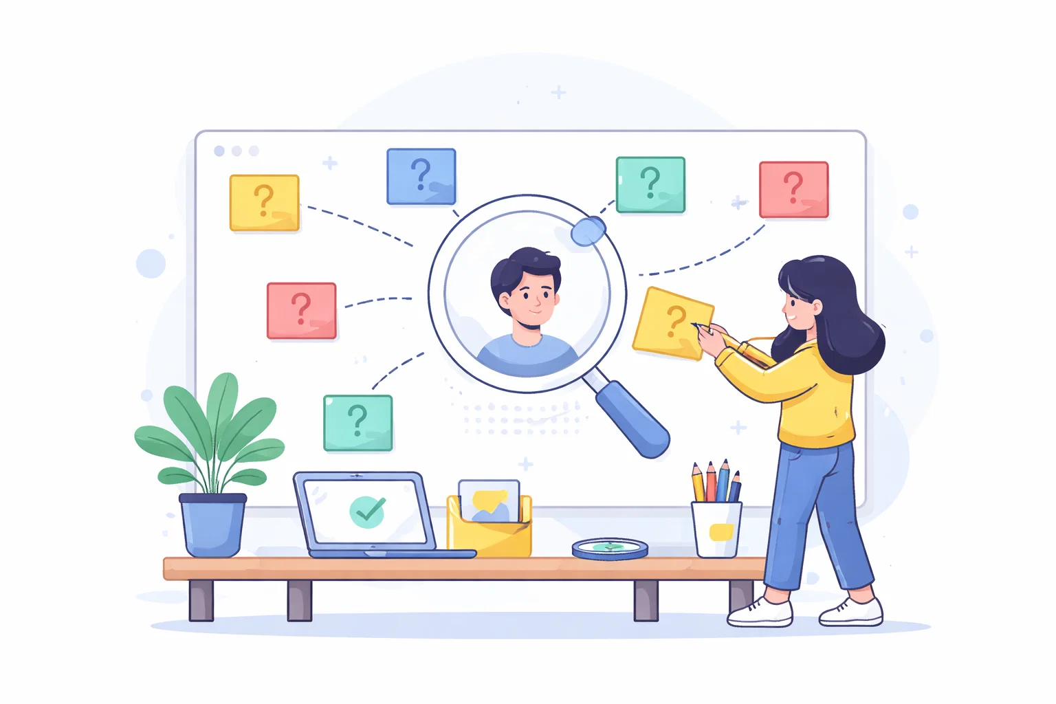
Mapping user questions before planning content
Mapping user questions before planning content is easier to handle when the underlying decision is made explicit. Here, I break down the practical trade-offs, what to review and how to move the work forward with less noise.

Share
Checking read-aloud support…
Mapping user questions before planning content
User questions are often the fastest route to a page structure that makes sense to real visitors. In planning a website before design or development starts, the real difficulty is usually not effort. It is uncertainty about what the page, section or decision is supposed to make easier. When that uncertainty stays in place, teams compensate by adding more copy, more features or more revisions. The website gets busier, but not clearer.
A better route is to use mapping user questions before planning content as a way of tightening the whole decision around the page. That means being honest about what the visitor is trying to understand, what the business needs the page to support and which parts of the work matter before anything visual changes.
Start With The Real Constraint
The first useful question is not usually “what should we add”. It is “what has to become easier once this page is better”. In planning a website before design or development starts, that often means choosing one practical outcome and using it to guide the rest of the work.
The review should normally cover:
- the pages that genuinely need to exist
- the user questions each page is responsible for answering
- what has to be settled before design work begins
- which decisions can wait until after launch
Once those points are visible, the page stops being a vague design or content task and becomes a clearer planning problem. That is usually where momentum improves.
Look For Quiet Friction
A lot of website problems are not dramatic. They are quiet. The headline is a little too broad. The structure makes the visitor work a little harder than necessary. The proof sits too far away from the claim it needs to support. The next step appears, but not at the moment a user is ready for it.
That kind of friction matters because it compounds. On a single page it might feel minor. Across the site it creates hesitation, weaker trust and more revisions because the team keeps treating the symptoms rather than the pattern underneath them.
Build Around One Useful Decision
When I review mapping user questions before planning content, I want the page to support one useful decision for the visitor. Sometimes that decision is whether this service is relevant. Sometimes it is whether the business feels credible enough to contact. Sometimes it is whether the content deserves another click deeper into the site.
That is why page structure matters so much. The order of information should make the next question easier to answer. The supporting sections should remove doubt instead of repeating what the headline already implied. The call to action should feel proportionate to the reading path rather than disconnected from it.
Keep The Revision Loop Small
One of the easiest ways to make website work heavier than it needs to be is to revise too much at once. If the page, message, layout and evidence all change together, it becomes difficult to tell which decision actually helped.
A smaller loop is usually more reliable. Clarify the page purpose. Tighten the hierarchy. Improve the weak section that is doing the most damage. Check how the change affects understanding and then move to the next adjustment. That rhythm is slower in appearance, but faster in practice because it reduces waste.
A Better Website Usually Feels Simpler
The goal of mapping user questions before planning content is not to make the site feel more elaborate. It is to make it feel more certain. A page that is better planned, easier to trust and clearer to act on usually feels calmer because it is doing less unnecessary work.
That is the standard I want for website strategy & planning work. Not more noise. Better judgment, applied in the places that matter most.