Prioritising mobile performance when time is limited
Mobile performance work benefits from a clear order. Here, I focus on the first choices that usually create the biggest improvement when time is tight.

Share

Checking read-aloud support…
Prioritising mobile performance when time is limited
Mobile performance often exposes every extra decision a page is carrying. Smaller screens, weaker connections and shorter attention windows make the waste much more obvious.
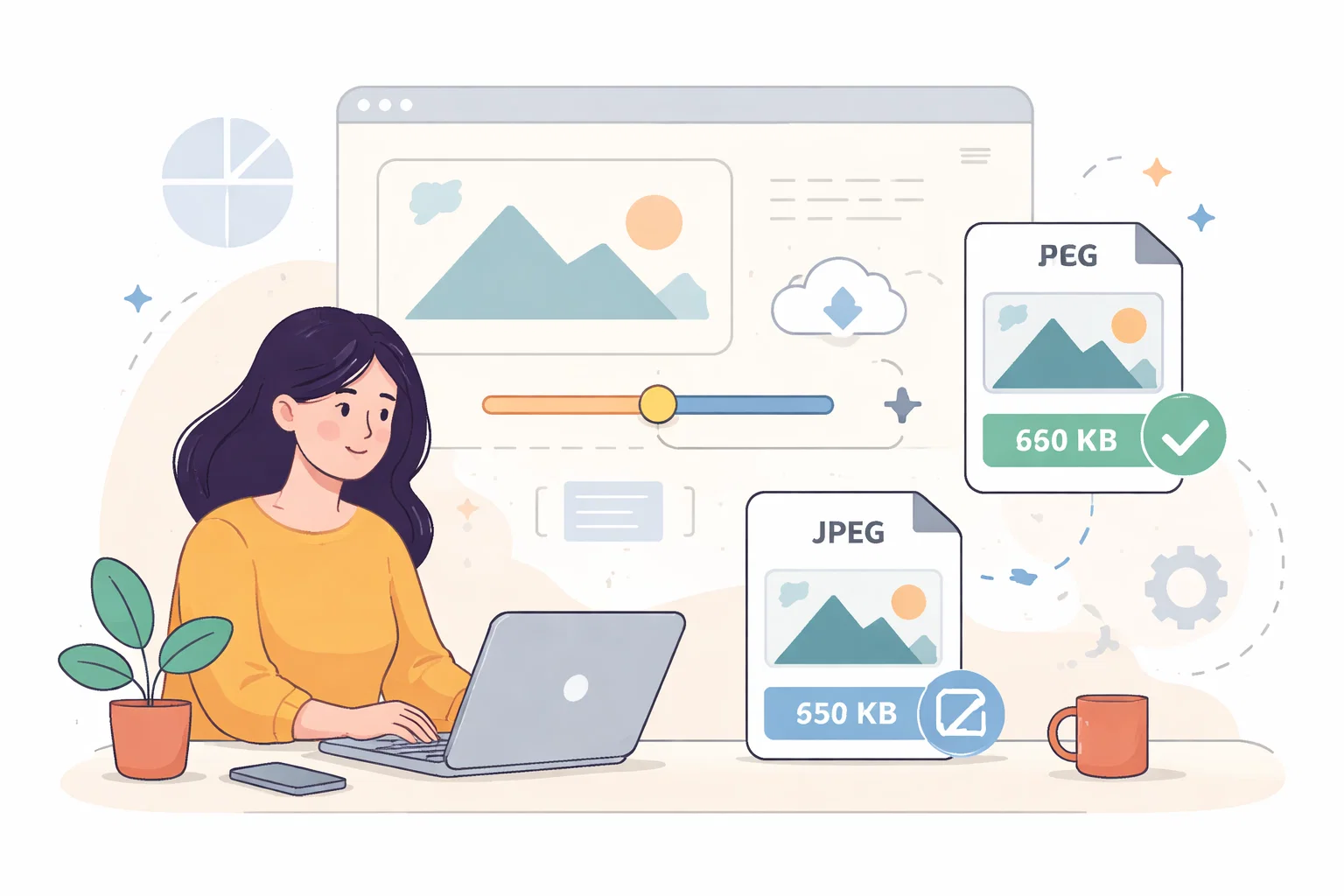
That is why priority order matters. The strongest gains usually come from the elements affecting first view, responsiveness and page stability first. In website performance optimisation, the real aim is usually faster loading, cleaner delivery and practical technical improvements that people can actually feel. That means reviewing the page, the surrounding process and the small decisions that either support that goal or quietly work against it.
Start With The Delay People Actually Notice
The first question is usually not whether the website could be improved in theory. It is whether the current setup is making the work heavier than it needs to be. When that happens, teams often compensate with memory, caution or repeated checking instead of fixing the source of the problem.
A stronger review keeps the website anchored to the real job it needs to do. That might mean clearer upkeep, a more useful audit output, lighter performance work or calmer conversion decisions. Whatever the angle, the page becomes easier to work with once the real priority is named directly.
Review What The Browser Has To Carry
A useful review normally checks things in order rather than trying to solve every possible issue at once. For this topic, I would usually review:
- what mobile users load before they can act
- where layout shifts undermine confidence
- which assets are oversized for smaller devices
- whether interaction is delayed by scripts that can wait
That sequence matters because it separates what is genuinely slowing progress from what only looks important on the surface. The clearer the order becomes, the easier it is to decide what should change now and what can wait.
Prioritise The Fixes That Change The Experience
One of the easiest ways to make website work heavier is to change too much at once. Smaller, well-judged decisions tend to outperform reactive batches because they show what is actually helping. They also make approval, testing and follow-up less chaotic.
That is why I usually prefer changes that tighten the page, reduce ambiguity and remove avoidable friction before introducing more complexity. A better result often comes from taking weight out of the process rather than adding another layer to manage it.
Performance Improves When The Whole Page Gets Simpler
When this work is handled well, the effect is usually visible in more than one place. The website feels steadier to maintain, easier to understand and less likely to create the same conversation again a month later. That is a stronger outcome than a fix that looks impressive but leaves the underlying pattern untouched.
A focused mobile pass often improves the whole site, because it forces the page to become more disciplined overall. It should become clearer who owns the next step, what improvement matters most and how the site can keep moving without unnecessary drama.
Keep The Next Step Proportionate
A good outcome here does not require turning the website into a major project again. It usually means choosing the smallest next step that removes the biggest drag on clarity, trust, performance or upkeep.
Good performance work is rarely about one dramatic fix. It is usually about removing the parts of the page that are doing more harm than value.