Protecting trust signals during a website redesign
A redesign can accidentally remove the details that help visitors trust the site. Here, I explain how to protect trust signals so the new version feels clearer, stronger and more convincing.

Share

Checking read-aloud support…
A Redesign Can Improve A Site And Still Weaken Trust
It is possible for a redesigned website to look cleaner, more modern and more polished while quietly becoming less convincing.
That usually happens when the redesign removes or downplays the details that were helping visitors feel reassured. Testimonials get pushed too far down the page. reassuring service detail is shortened too aggressively. Process explanations disappear. Specific proof is replaced with vague claims. Contact routes become tidier but less human.
None of that may seem dramatic in isolation, but together it can reduce confidence fast.
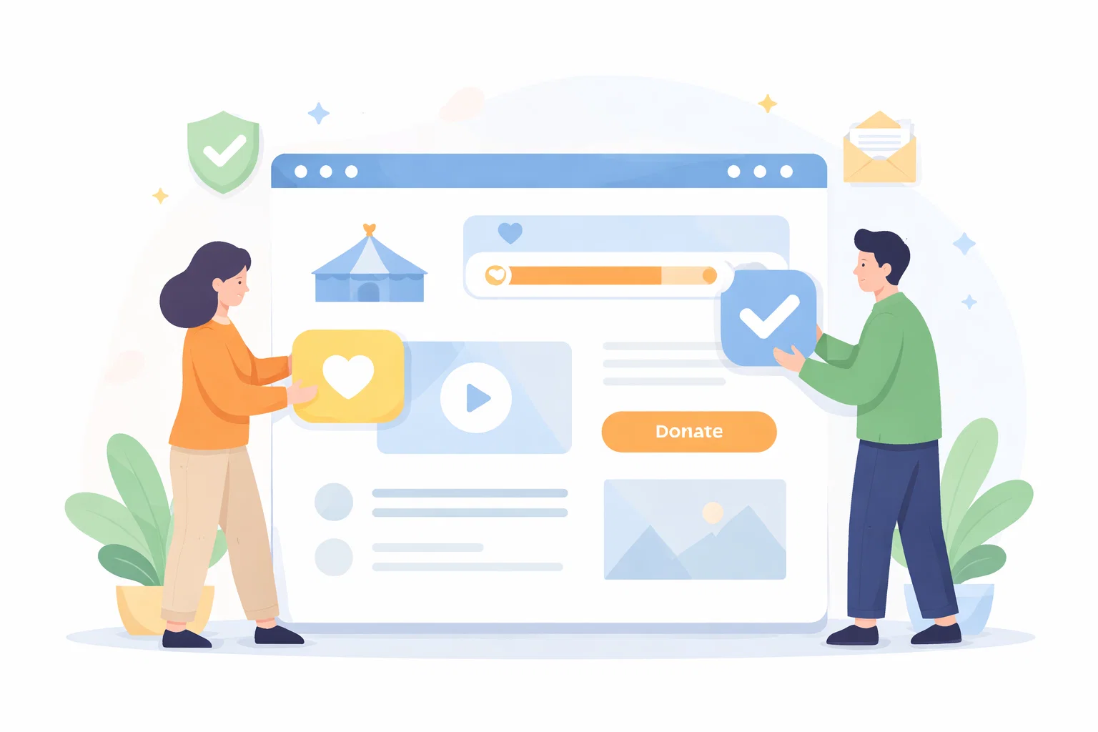
Trust Signals Are Often Doing More Work Than People Realise
Many of the elements that build trust do not look dramatic in a design review.
They are often modest details such as:
- a clear explanation of what is included
- recognisable examples of past work
- practical process steps
- reassuring language around timing or support
- names, faces or context that make the business feel real
Because they are quiet elements, they can be lost easily when a redesign focuses too heavily on visual cleanliness.
Cleaner Layouts Still Need Evidence
A cleaner design is usually helpful. Better spacing, calmer hierarchy and more confident typography can all improve trust. The risk comes when minimalism is used as a reason to strip away useful reassurance.
Visitors still need evidence.
They still need enough substance to answer questions such as:
- do these people understand my kind of problem
- can they deliver this well
- what will the process feel like
- what makes this offer credible
If the redesign is not answering those questions, it may feel polished but not persuasive.
Audit Trust Before You Move Things Around
Before redesigning pages, it helps to identify where trust currently comes from.
That can include:
- testimonials or endorsements
- case studies
- relevant experience
- before-and-after examples
- delivery process details
- clear guarantees, boundaries or expectations
Once you know which elements are carrying trust, you can decide how to improve their placement rather than deleting them accidentally.
Trust Signals Need Context, Not Just Presence
Adding proof is not enough on its own. The page also has to make that proof meaningful.
A testimonial without context is weaker than one attached to a clear service. A logo strip without explanation may look impressive but say little. A process section helps more when it appears exactly where a visitor is likely to wonder what happens next.
In other words, trust signals should be placed where they answer hesitation.
That is why redesign work should consider reading path as well as visual style.
Service Pages Often Need The Most Protection
Trust is especially fragile on service pages because those pages are usually doing the most decision-making work.
If a redesign trims too much from a service page, visitors may lose:
- clarity about what is offered
- proof that the offer is credible
- reassurance about how the work is handled
- the confidence to enquire
That does not mean service pages should become long by default. It means the detail they contain should be chosen carefully instead of reduced casually.
Design Reviews Should Include A Trust Check
One simple way to avoid trust loss is to review redesigned pages with a specific question in mind:
What on this page helps a cautious visitor feel more certain?
If the answer is vague, the page probably needs more work.
This kind of review is useful because it shifts the conversation away from whether the page looks cleaner and toward whether it still supports belief and action.
Redesigns Should Strengthen Reassurance, Not Hide It
The strongest redesigns do not just preserve trust signals. They often make them easier to notice and easier to understand.
That can mean:
- moving proof closer to key decisions
- rewriting generic claims into specific reassurance
- tightening visual hierarchy so the important evidence is easier to scan
- making contact routes feel more direct and human
The aim is not to crowd the page. It is to make reassurance work harder.
A Better Design Still Has To Feel Believable
Ultimately, a redesign succeeds when the site feels more certain, not just more refined.
That confidence comes from a combination of structure, messaging, proof and visual judgement. If any one of those parts is weakened, the site can look improved while feeling less trustworthy.
Protecting trust signals is not an extra layer added at the end.
It is part of making sure the redesign improves the site in the ways that matter most.