Ecommerce homepages should reduce decision fatigue
Online shops lose momentum when the homepage asks visitors to process everything at once. Here, I explain how homepage design can reduce decision fatigue and guide people into clearer buying routes.
Share

Checking read-aloud support…
Ecommerce homepages should reduce decision fatigue
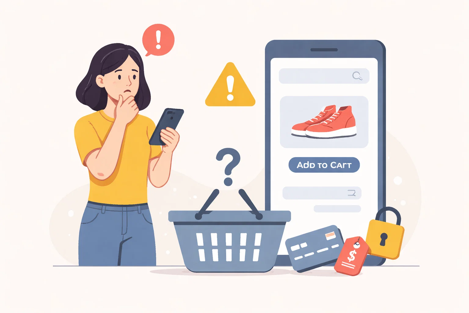
An ecommerce homepage is often carrying too much pressure. It needs to introduce the brand, orient first-time visitors, surface products and support conversion momentum. That job becomes much harder when the page presents too many equal options at once.
Start With The Pressure Point
Decision fatigue usually starts before anyone reaches a product page. The visitor lands on the homepage, sees too many competing pathways and has to decide what matters before the site has done enough to help them decide.
Shape The Work Around One Clear Priority
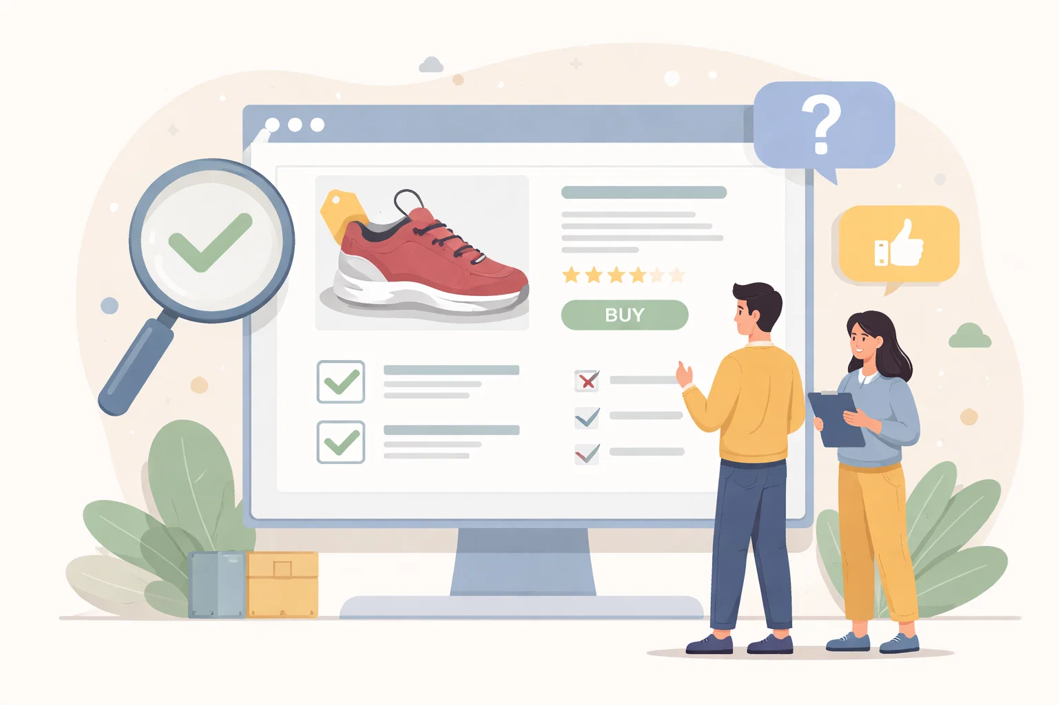
The homepage usually works better when it reduces the first decision. That might mean leading with a smaller number of collections, a clearer shopping path or stronger cues about who certain products are for. The point is to narrow the choice enough that browsing feels easier to continue.
Review The Parts That Influence The Outcome
A useful review here usually checks:
- how many primary choices the homepage is asking for immediately
- which product paths deserve the strongest prominence
- where the page can reassure without slowing browsing
- what should be removed because it creates equal-weight noise
That order matters because it stops the page from becoming a general reaction to pressure. The clearer the sequence becomes, the easier it is to decide what needs action now and what can wait until the situation is steadier.
Avoid Creating A Bigger Problem
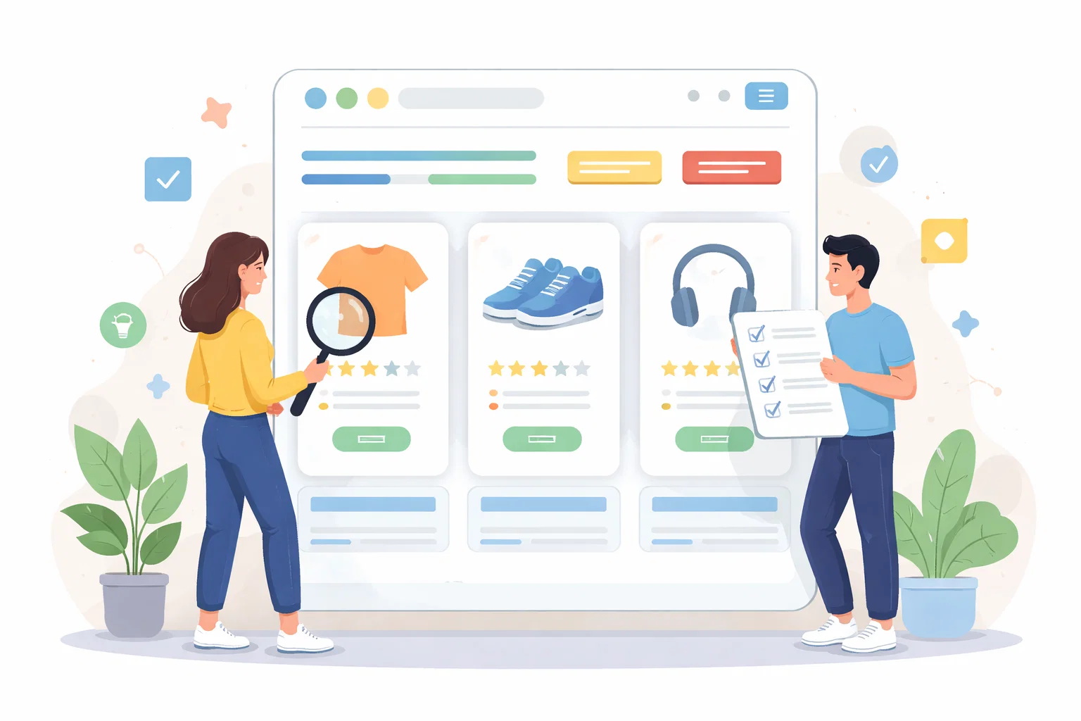
A common mistake is mistaking abundance for usefulness. More product blocks, more announcements and more banners can make the page feel active, but they often increase uncertainty instead of helping someone shop.
What Better Looks Like
A clearer homepage creates momentum. Visitors move into a useful route faster, understand where to go next and feel like the store is guiding them instead of handing them a wall of decisions.
Keep The Next Step Proportionate
When the homepage reduces cognitive load early, the rest of the shopping journey gets more of the visitor’s attention rather than having to recover from indecision.