Checkout friction often starts before the basket
Checkout drop-off does not always begin on the checkout page itself. Here, I explain how earlier design choices often create the uncertainty that shows up later as basket abandonment.

Share
Checking read-aloud support…
Checkout friction often starts before the basket
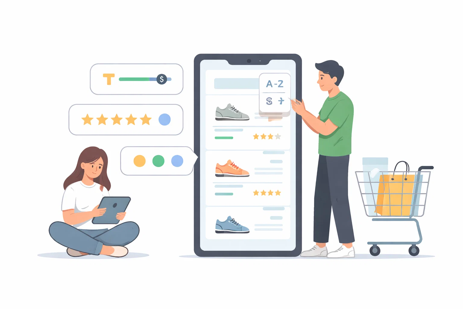
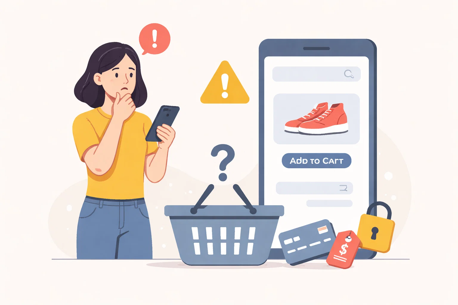
When people abandon a basket, teams naturally focus on the checkout. Sometimes that is the right place to look. Often, though, the real friction began earlier when the page failed to answer a practical question about trust, delivery, returns or fit before the visitor reached the basket at all.
Start With The Pressure Point
Uncertainty accumulates. A visitor may add an item to the basket while still feeling unsure about shipping, timing or product details. By the time checkout asks them to commit further, that doubt has become heavy enough to stop progress.
Shape The Work Around One Clear Priority
The stronger approach is to review the whole buying path before assuming checkout is the sole problem. Product pages, category pages and even the homepage may all be creating small amounts of ambiguity that only become visible once someone reaches the final step.
Review The Parts That Influence The Outcome
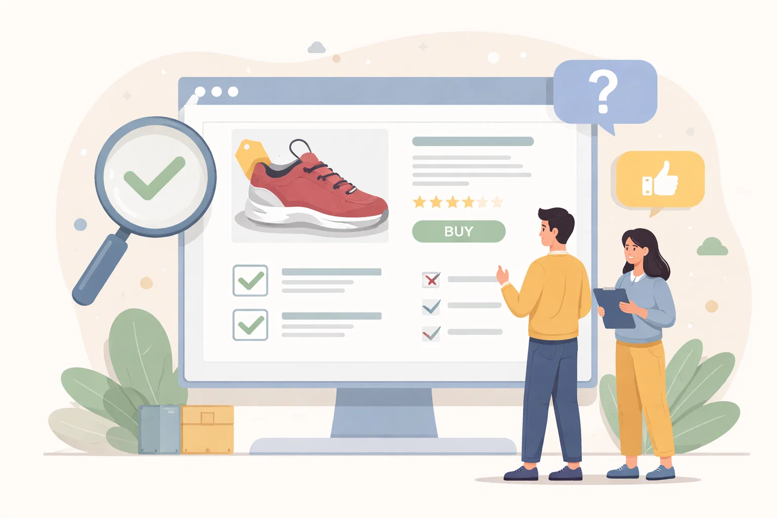
A useful review here usually checks:
- which questions shoppers still carry into checkout
- whether delivery and returns detail is visible early enough
- how much product certainty the page creates before basket action
- what reassurance is missing just before commitment
That order matters because it stops the page from becoming a general reaction to pressure. The clearer the sequence becomes, the easier it is to decide what needs action now and what can wait until the situation is steadier.
Avoid Creating A Bigger Problem
One mistake is trying to fix abandonment by simplifying forms alone. That can help, but it does not solve uncertainty generated earlier in the journey. Checkout becomes the place where the doubt shows up, not necessarily where it began.
What Better Looks Like
A stronger buying flow answers key questions before they become objections. Checkout then feels like the natural conclusion of the journey rather than the place where trust has to be rebuilt from scratch.
Keep The Next Step Proportionate
When teams review pre-checkout friction properly, they usually find improvements that strengthen more than one page at once.