Structuring charity homepages around real visitor needs
Community-focused homepages often carry too many jobs at once. Here, I explain how to structure the homepage around actual visitor needs so the page becomes easier to trust and use.

Share

Checking read-aloud support…
Structuring charity homepages around real visitor needs
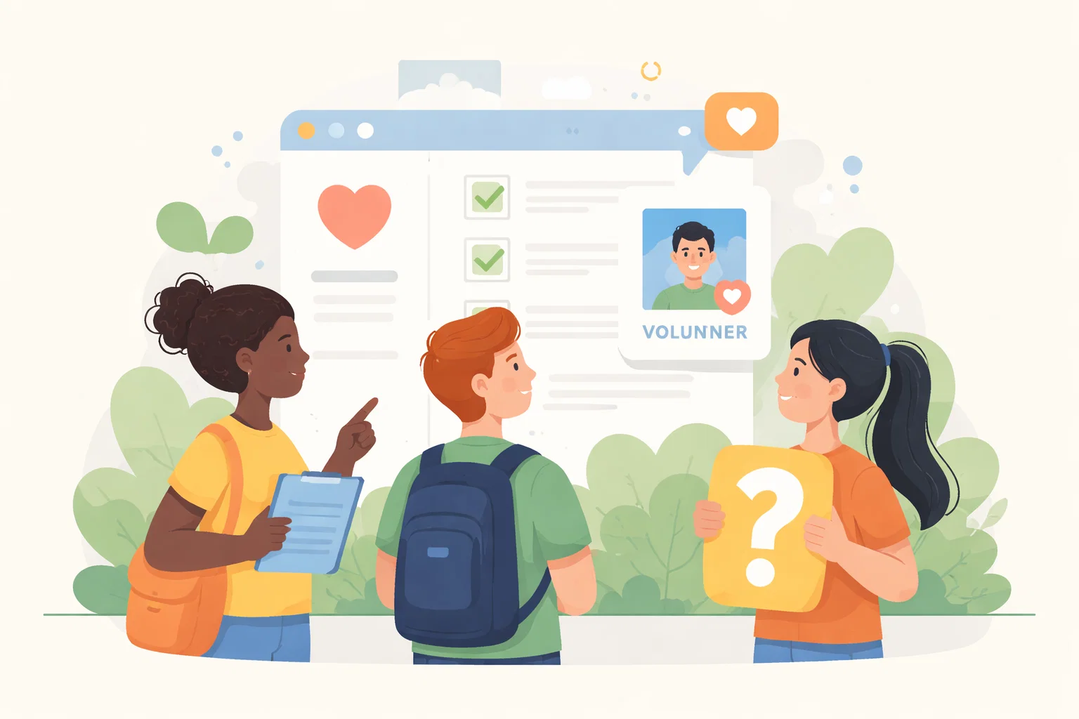
Charity homepages are often asked to do far too much without a clear order. They need to reassure people seeking help, support donors, guide volunteers and explain the organisation itself, sometimes all in the same first screen. That only works when the structure reflects real visitor need rather than internal wish lists.
Start With The Pressure Point
The page usually becomes difficult when every audience is given equal prominence from the outset. Instead of helping people orient quickly, the homepage asks them to work out where they fit and which path might serve them best.
Shape The Work Around One Clear Priority
A clearer homepage starts by deciding which visitor questions need answering immediately. For many organisations that means making support routes obvious, donation routes trustworthy and introductory language simple enough that nobody has to decode what the organisation actually does.
Review The Parts That Influence The Outcome
A useful review here usually checks:
- who the homepage must help first in a typical visit
- which top-level routes deserve immediate visibility
- what credibility or reassurance is needed above the fold
- which secondary messages can move lower without causing harm
That order matters because it stops the page from becoming a general reaction to pressure. The clearer the sequence becomes, the easier it is to decide what needs action now and what can wait until the situation is steadier.
Avoid Creating A Bigger Problem
A common mistake is treating the homepage as a neutral billboard. In practice, it is an orientation page. If it cannot help people identify the right route quickly, the rest of the site has to compensate for confusion that should have been solved earlier.
What Better Looks Like
A better homepage feels calmer. The visitor understands who the organisation helps, where to go next and why the site can be trusted, all without being forced through layered messaging or abstract navigation.
Keep The Next Step Proportionate
Once the homepage is structured around real need, the rest of the site becomes easier to organise because each main path has a clearer job from the start.