Accessibility decisions that help small charity teams
Accessibility is not just for compliance checklists. Here, I explain why accessible design choices often make charity websites clearer for both visitors and the teams maintaining them.
Share

Checking read-aloud support…
Accessibility decisions that help small charity teams
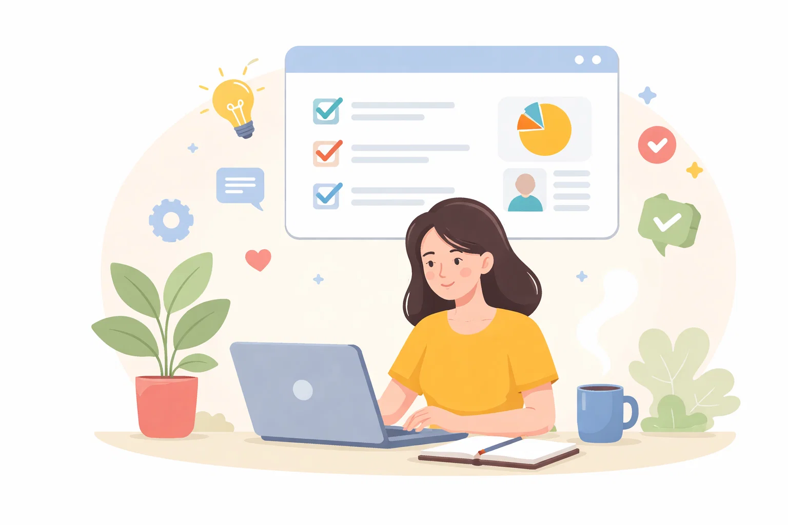
Accessibility is often framed as extra work, especially for small teams already stretched by content, approvals and service delivery. In practice, good accessibility decisions usually simplify the website itself. They make content clearer, navigation stronger and maintenance choices easier to judge.
Start With The Pressure Point
The main difficulty is that accessibility can sound abstract until it is connected to the day-to-day work of the site. Teams know they should care about contrast, headings and keyboard access, but they are less often shown how those choices make the website easier to update and trust.
Shape The Work Around One Clear Priority
I usually bring accessibility back to structure. If headings are sensible, copy is readable, link states are obvious and forms avoid unnecessary friction, the site becomes easier for visitors and easier for staff to maintain without guesswork.
Review The Parts That Influence The Outcome
A useful review here usually checks:
- whether the page hierarchy is understandable at a glance
- if buttons, links and forms are behaving predictably
- where readability drops because of layout or contrast choices
- which accessibility improvements would also reduce support burden for the team
That order matters because it stops the page from becoming a general reaction to pressure. The clearer the sequence becomes, the easier it is to decide what needs action now and what can wait until the situation is steadier.
Avoid Creating A Bigger Problem
Small teams get trapped when accessibility is treated as a specialist layer added after design. That makes it feel expensive and disconnected. The stronger route is building it into ordinary content and layout decisions from the start.
What Better Looks Like
A more accessible site tends to become more durable. It is easier to update, easier to QA and less likely to create hidden friction for the people who rely on it most.
Keep The Next Step Proportionate
For charity websites, accessibility is usually one of the clearest examples of good structure making everything else easier rather than harder.