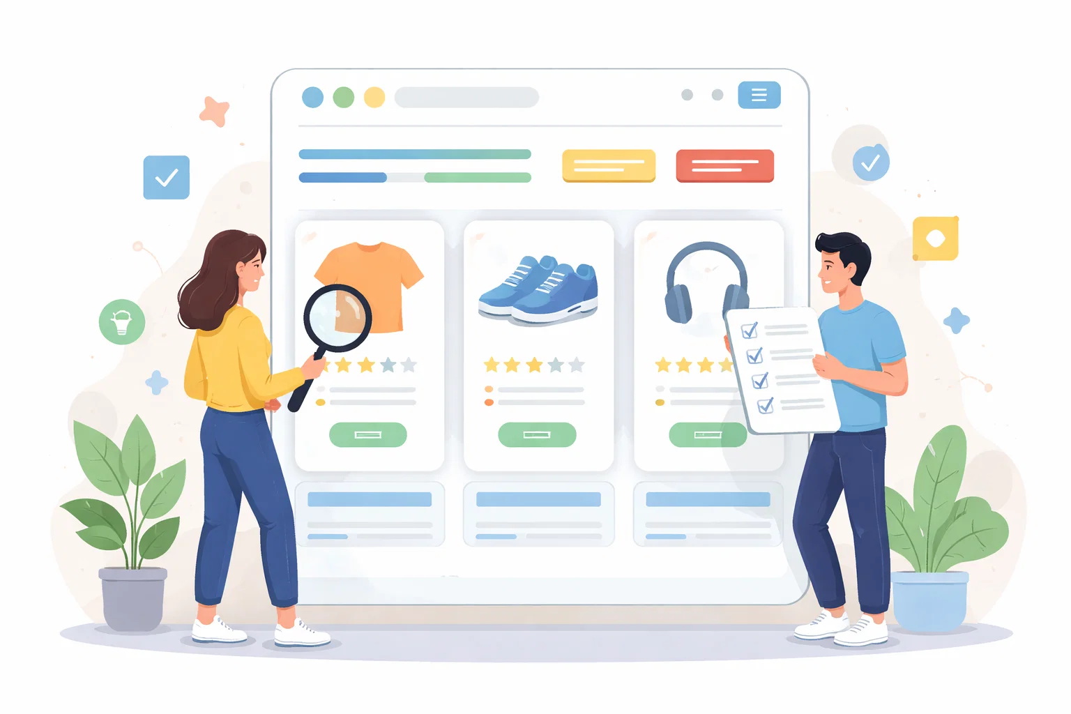
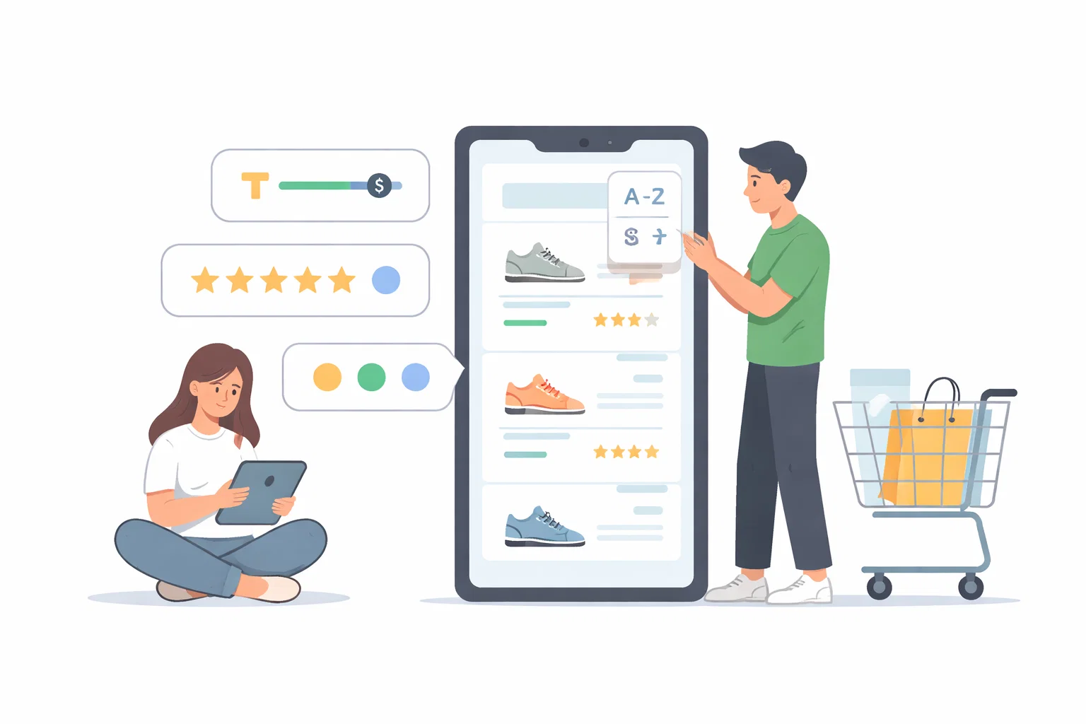
Filtering and sorting should support buying decisions
Filters and sort tools can help or quietly frustrate the shopping journey. Here, I explain how to design them around real buying decisions instead of product-database logic.

Share
Checking read-aloud support…
Filtering and sorting should support buying decisions
Filtering and sorting often look like utility features, but they play a major role in whether a category page feels easy or exhausting to use. When they reflect real buyer logic, they help the visitor narrow options with confidence. When they reflect internal catalog logic only, they create more work.
Start With The Pressure Point
The gap usually appears when the store exposes attributes that are technically accurate but not especially useful at decision stage. Shoppers need help finding what fits their context, budget, taste or requirement, not just a longer list of available product fields.
Shape The Work Around One Clear Priority
I normally review filters through the lens of decision support. Which options genuinely help someone rule products in or out? Which sorts help them compare more sensibly? Which controls only add clutter because they do not match the real shopping question?
Review The Parts That Influence The Outcome
A useful review here usually checks:
- what people are most likely trying to narrow by
- whether the current filter labels reflect that language clearly
- which sort options support comparison best
- where the controls are creating friction instead of reducing it
That order matters because it stops the page from becoming a general reaction to pressure. The clearer the sequence becomes, the easier it is to decide what needs action now and what can wait until the situation is steadier.
Avoid Creating A Bigger Problem
It is easy to assume more filters are always better. In reality, too many weak filters can make the interface feel denser without helping the buyer move any faster toward a useful set of options.
What Better Looks Like
A stronger filtering experience reduces hesitation because the page starts to behave more like a guide than a database. That makes the category page feel more supportive and less overwhelming.
Keep The Next Step Proportionate
Good filter design is usually evidence that the team understands how customers choose, not just how products are stored.